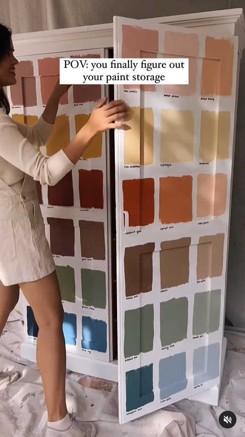
My 72-Color Paint Swatch Cabinets – Part 1
I’m currently working on the paint swatch cabinet just inside the studio from the breakfast room door. If you missed my previous post about this, I’m using this cabinet makeover from Geneva Vanderzeil as my inspiration.
So after spending the weekend sanding, priming, and paint the door fronts white, I was finally ready to move on to the fun, colorful part of the project.

Now let me answer the question that I know many of you will inevitably have. If I started out with white IKEA Veddinge cabinet doors, why in the world did I sand, prime, and paint them white?
The reason I had to do that is because the original finish on the IKEA Veddinge cabinets and drawer fronts is super slick and shiny. And it is a very nice factory finish. So if I were to paint latex paint right over that original finish, it would just scrape right off. There’s no way a latex paint would stick to that original finish.
So even though I needed the doors to start off white, I had to sand, prime, and paint them with a paint that would actually accept additional layers of latex paint over the top without scraping off as if I had painted latex paint on glass.
So after prepping the door fronts, I placed them on the floor as they would appear once they’re installed on the cabinets, and then began planning and marking off where the paint swatches would go. The doors for the top row are 20 inches high, the middle row doors are 30 inches high, and the bottom row doors are 40 inches high. And the entire things is 60 inches wide spanning four doors.
With those measurements, the layout that made the most sense and gave me uniform sizes from door to door, row to row, was to have eight colors across, and nine colors down.

My markings in the photo above will probably only make sense to me, but that’s not what’s important. Let me repeat. I ended up with eight colors across and nine colors down.
Eight times nine. That’s 72 colors! Even after marking those off, and writing down that I needed eight across and nine down, it didn’t really sink in that I was talking about using seventy-two paint colors until I actually got to Home Depot to pick them out.
SEVENTY-TWO PAINT COLORS!!! 😀 Don’t get me wrong. I’ve got no problem using 72 paint colors (or 100, or 250) on a project. The more colors, the better, as far as I’m concerned. But have you ever tried to pick out 72 paint colors from one end of the spectrum to the other to create a somewhat coordinating gradient? Ummmm….it’s not easy.
Well, let me take that back. It would have been incredibly easy had I just been able to pick out 72 random colors from the Behr display, starting at one end and ending at the other end, and then purchase al 72 in sample sizes. But that would have cost $466. There was no way I was going to pay $466 on 72 paint samples. Plus, they didn’t even have that many paint samples in stock. I asked, because during one insane split second, I actually considered it.
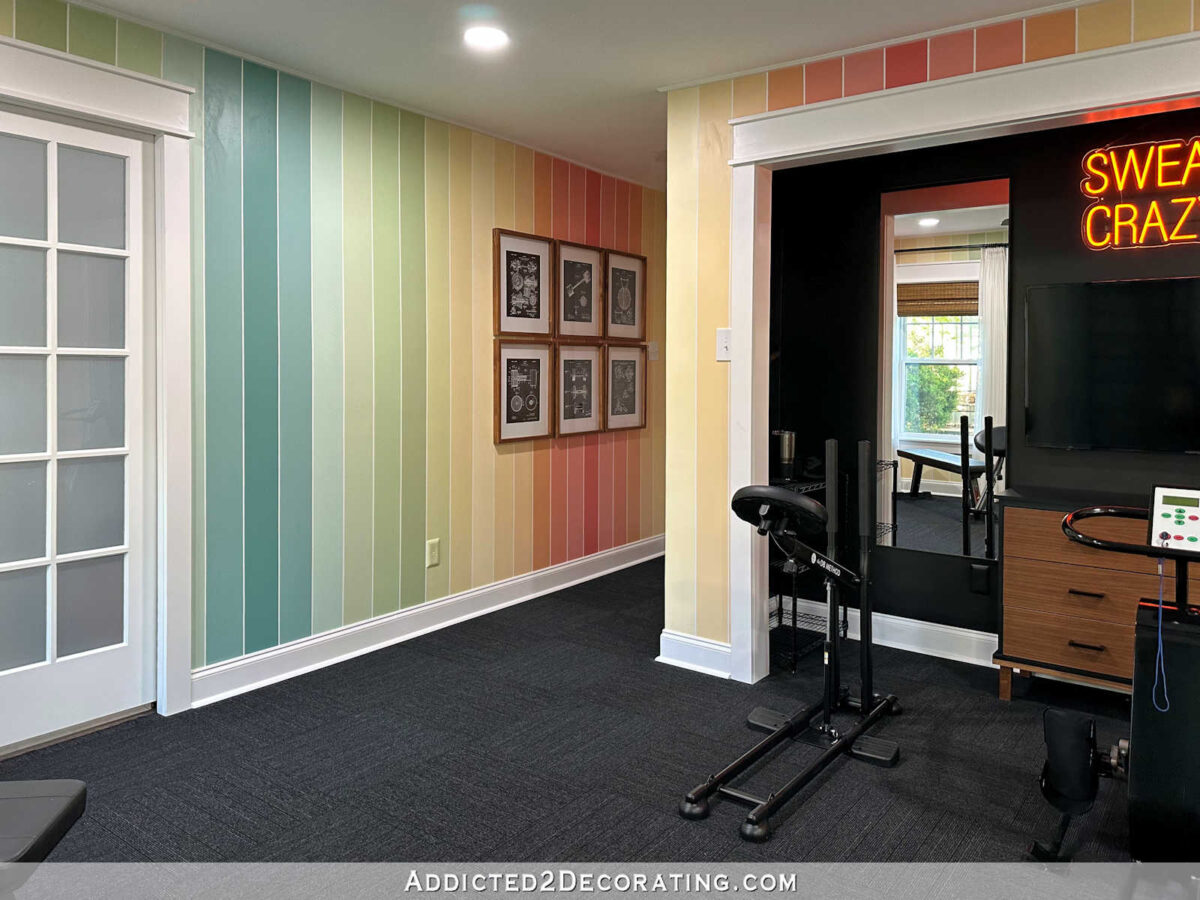
So in order to save money, I wanted to incorporate all (or most) of the colors I knew I already had on hand. For example, I already had 15 colors that I used on our home gym walls.
I also had seven brand new quarts that I purchased several months ago for a project that I changed my mind on and never did. So after taking inventory of those, and determining that I already had 22 colors that I could use on these cabinets, I headed to Home Depot to fill in the other 50 that I needed. So that’s really what made it complicated — having to use those 22 and fill in with 50 more while trying to make the gradient look somewhat cohesive.
But I did it! And it only took me about an hour-and-a-half. 😀 It was a fun challenge, and I ended up with 72 pretty great colors.

Then I had to separate them out into three categories. There was still no way I was going to buy 50 paint samples. Not only would that have cost $323.67 (still way to much), but again, they didn’t even have that many paint samples in stock. So I separated the 72 colors into (left) the 22 colors I already had at home, (right) the colors I thought I could mix myself, and (center) the main colors I needed to purchase in order to mix the rest of the colors. I ended up needing to purchase 17 samples, which cost $110. That seemed like a reasonable price to me.

Here are the 17 samples that I ended up purchasing. You can see that they’re the deeper, darker, more saturated colors. I figured that if I had the main deeper, more saturated colors in the gradient, I could use those to mix with white, mix with each other, etc., to create the other 33 colors that I needed.

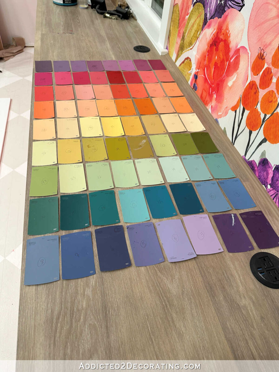
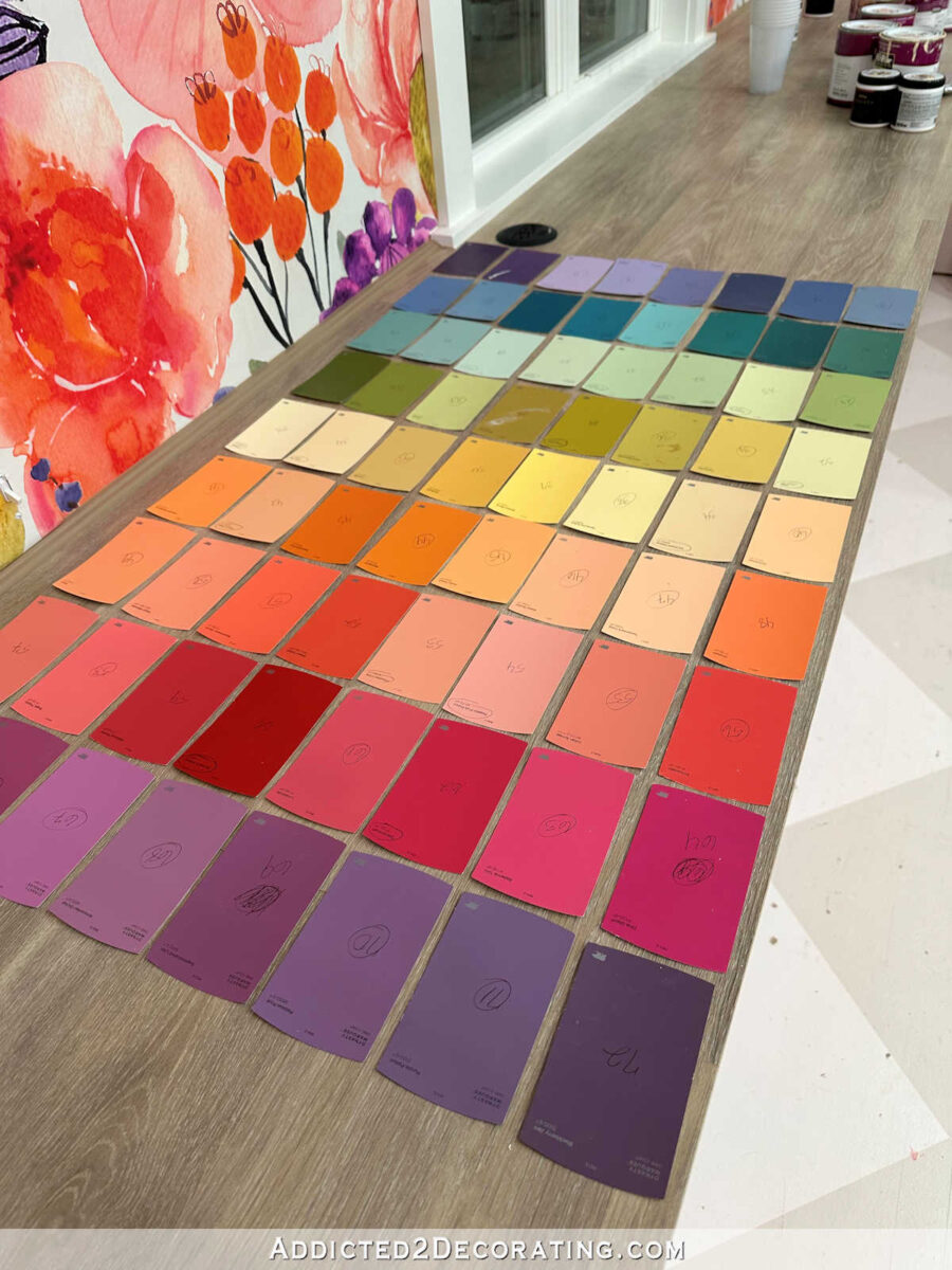
While at Home Depot, I numbered all of the 72 swatches so I could easily keep them in order. I didn’t want to have to reorganize them from scratch in that gradient again. So when I got home, I lined up the paint swatches in order across the long countertop in the studio.
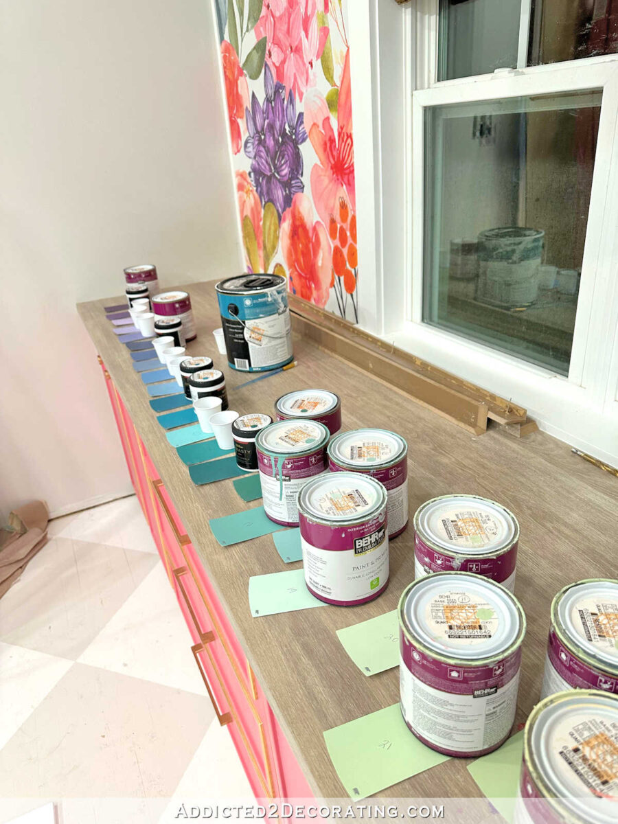
And they stretched from one end to the other, plus about nine in a second row on the back. And then I organized the paints that I already had on the matching swatches. On the other 33 that I didn’t already have paint for, I placed a cup so that I could mix those paints using the other paints.

Let me show you a couple of examples. You can see that I purchased a sample of color #2, which is a darker purple. I didn’t purchase color #3, the lighter purple, because I could make that color using the darker purple mixed with lots of white.
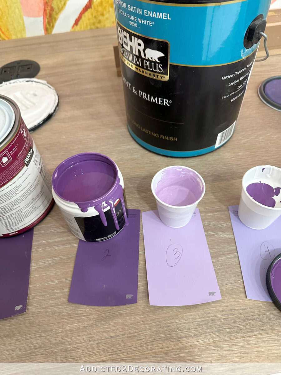
The next color, #4, is also a light purple, but you can see that it has just a touch of blue in it. So I mixed a lot of white, some of the #2 dark purple, and just a touch of the dark #6 blue.

Color #5 above also appeared to be a light purple, but it’s darker and has quite a bit more blue in it than the previous color. So I mixed a lot of white, more of the #6 dark blue, and just a touch of the #2 dark purple. And that’s how I went along until the rest of the 33 colors had been filled in.
So let me show you all 72 colors, and how they will appear on the cabinets. It starts with purple and ends with purple, and spans the entire spectrum in between. I’m not quite sure if I’ll put the colors on the cabinets so that they look like this, with the purple and then the pinks at the top…
Or if I’ll put them in this order, so that the colors go from purple at the top to blues and teals.
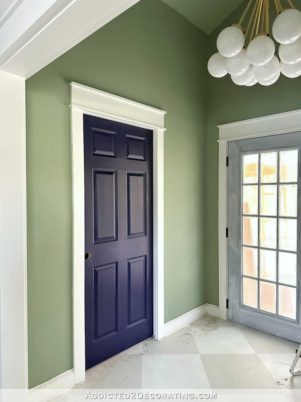
And here’s what they look like with the mural. I think they complement the mural beautifully! Of course, these colors won’t be near the mural. They’ll be on the wall opposite the mural wall.

It took a whole lot of prep work to get the doors prepped for paint, and then to mix those paint colors. And I still have to tape off all of the rectangles on the cabinet doors before I can get started painting. But I’m almost giddy with excitement about these cabinets. I may even like this one more than my pink cabinets! I mean, for someone who loves color as much as I do, can you think of anything dreamier than a section of cabinets painted with 72 different colors?! I’m so excited about this. 😀
Note: This is a multi-post project. You can find the next posts about this project at the following links: Part 2 — the painted cabinet doors; Part 3 — framing the cabinet; and Part 4 — the finished paint swatch cabinet.

Addicted 2 Decorating is where I share my DIY and decorating journey as I remodel and decorate the 1948 fixer upper that my husband, Matt, and I bought in 2013. Matt has M.S. and is unable to do physical work, so I do the majority of the work on the house by myself. You can learn more about me here.

I love this! it reminds me of a phone game i have called “I love Hue” Instead of gradient colors from right to left and then the next row have you considered organizing them corner to diagonal corner. I cant wait to see how it comes out!
I love that game! It’s so satisfying and deeply relaxing.
You are amazing!
So glad you had so much fun with this project! I viewed the storage cupboard it as way to keep your inventory of paint organized – I would have left some squares to fill in for future leftover paint as it came into my life lol.
I can’t believe how you can visualize and then figure out how to make what you want — this time with color. So complex. And the resulting “product” is just right. Those colors are perfect with your mural.
A couple of features I love about the inspiration photo is the white space in between the color swatches and the hand-lettered names of the colors, giving a freer, hand-crafted feel. I also like the fact that the arrangement does not use every possible color, but is limited to fewer and quieter earth colors or less-saturated colors, which are less demanding on the eye. Also, the color swatches of the inspiration photo have a brush-painted, freer quality rather than the tight, perfect rectangles would. That ‘looseness’ allows my eye to rest and move and not look for pattern and precision, and thereby not pull my attention from the beautiful wallpaper. Just my opinion! Your cabinet is going to be lovely however you do it.
I like the original, too, but I think you know better than to expect quieter earth colors from me. 🤪 I still haven’t decided if I’m going to do the hand brushed look. I love that, but my cabinets are visible from the entryway, living room, kitchen, and breakfast room. I’m not sure how I feel about that hand brushed look being visible from those areas. I tend to think something a little more refined, structured, and put together would work better for my particular home. But we’ll see!
I tend to agree. Im afraid the brush strokes would make it look ragged in a more refined room. But it’ll turn out great regardless how you do it. It always seems to do so. Love it.
Whoa, I’d love to see inside your head..astonishing!
C
I’m surprised you did not just decoupage the actual samples down. I have done that several times and it looks really cool. I do love all the colors.
I considered it briefly, but I’m generally not a fan of decoupage on furniture. There are a few exceptions, but I generally like to keep decoupage limited to accessories and crafty projects.
Would it have been easier to head to your craft store and grab small bottles of acrylic paints? Or are you looking to use only the colors in your home?
I don’t think that would have been easier because the options would have been a fraction of the options available at Home Depot. Being able to see the display of hundreds of Behr colors, and the order in which they are displayed, was actually very helpful.
I also like the inspiration photo w the colors being a bit “rough” at the edges rather than crisp lines. I think they would tie into the organic feel of the floral wallpaper and not be more geometric shapes next to the checkered floor. Might be fun to create your own names of the colors for each swatch you mixed yourself too. I’m excited to see this project come together.
Love, love, love your beautiful bouquet of a house!
Have you thought of using a stencil? A pinwheel shape comes to mind.. I’m afraid it’ll be too close to your bathroom with rectangles but not quite close enough. Lovely colors!!
I love this, but everytime I see a project on the floor, MY back aches!! Take care of yourself, Kristi! Make sure you get some . . . I don’t even know what I was going to say! Just, be gentle and do some Epsom salt soaks in your beautiful tub!
How much FUN are you having?! Luv it!
You’re a mad genius. Looks terrific.
You are amazing. Beautiful color mix and such a great cmpliment to the murel wall. Can’t wait to see the finished cabinet.
I like the darks on top and bottom (like on countertop below wallpaper) but in every configuration that bright turquoise one in the row of teal and blue (?? Second row from bottom) just jumps out at me. The adjacent ones don’t seem to relate to it at all. You are amazingly creative!
I love all the colors! Have you considered using the rainbow as inspiration for your color sequence?
Kristi, I love the idea and colors you picked! I personally prefer the pink on top and teals toward the bottom, because the teals feel like heavier colors and ground the furniture (in my mind), but I think it’ll look amazing either way. Have fun creating!
Knowing me I would have left it white and called it a day! I cannot wait to see the outcome of this fantastic idea! Good luck!!!
Kristi, I do love your 72 color idea for your studio cabinets. The colors do compliment your wall mural. Whatever arrangement you choose to put the color swatches on the cabinets will end up looking amazing. You have put so much prep time getting this idea put together…you just never seem to run out of steam. When this part of your studio is complete, you will be another step closer on having the most colorful and organized studio to work in, or just to go in there and relax looking at all of your genius.
OMG…you are incredible. While I was reading, I was getting stressed about so many colors, etc., and wondered if it was still going to remind us of the colors in the mural wall. THEN, I saw it together. You are some kind of craft-mad-scientist…I could never even consider what you are doing. Meanwhile, I can’t wait to see what you do…I KNOW you won’t wait long to start…it IS exciting!!!
How about gold leaf around each swatch? Like a frame.
You are a genius.
I can feel your excitement! What a fabulous and fun thing to do!!! Can’t wait to see it.
I was thinking about you painting the doors. I’m in Australia and have painted 4 kitchens now, using water based acrylic paint on slick cabinet doors. I’ve used a product called Easy Surface Preparation (ESP), which adheres paint to the slick surface extremely well. Even after many years it never scratches or peels off. I’ve even used it to adhere paint to mirrored sliding doors on a wardrobe, and, after 7 years, there’s not even a scratch on them. There’s also laminate paints which may have helped, although I’ve never needed to use them. I’m sure you’re aware of these sorts of things, so am very interested in why you chose not to use them. Certainly not criticising, Kristie, just interested. Thank you.
I generally like to stick with tried and true methods that I know for sure will work because I’ve used them repeatedly rather than gambling on new (to me) products. I’ve used so many products through the years that make big claims but don’t live up to the claims, and it’s frustrating to have those setbacks. So tried and true methods and products are my go to.
You are truly amazing!!!!
I’ve long wanted to do a paint sample cabinet but with only a few colors. This is going to gorgeous and I can’t wait to see it finished.
My brain has exploded while trying to comprehend what I’ve just read. That’s why I keep coming back to your blog 🙂
Looking forward to the finished project!! 🙂 🙂 🙂
You are wild and crazy and AMAZING! I am forever awed by your creativity, boldness, and energy! I can’t wait to see the finished cabinet. 🤩
I always like to put colors in the order of the spectrum. Do you remember Roy G. Biv? Red, Orange, yellow, green, blue, indigo, violet. It’s my favorite! ☺️