A Small Color Change Can Make A Huge Difference
Well, I painted my breakfast room buffet again. This is the fourth time I’ve painted this buffet since I got it in 2015. 😀 So far, this buffet has been coral, black, dark purple, and now it’s an even darker and deeper purple. And I’ll paint it again in the future if I think it needs to be a different color. But for now, in its current position in this room with its current decor, I think its new color is perfect.
I wanted to keep it purple because it works great with the purple benches in the room, and it ties in well with the living room. And both rooms can be seen from the kitchen. But the problem is that the purple that was on the buffet, which I thought was such a deep and dark purple, actually looked pale and washed out next to the new curtains in the room.
I originally painted it purple for the original breakfast room remodel that I finished in 2017. It looked like such a deep and dark eggplant in that room. This color is Behr Voodoo.

But when I started making changes to the room, and especially when I added the new curtains right by the buffet, that purple that I thought was so deep and dark seemed to turn into a washed out, faded purple.
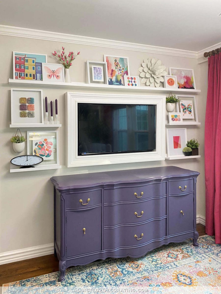

And on really sunny days when the room is being filled with natural light, the buffet would look so washed out that it looked like I had actually repainted it a light purple color. And it just didn’t work with the strong, saturated color on the curtains.

So I went in search of a true, deep, dark eggplant color. My initial thought was to try Benjamin Moore Shadow. Do you remember that color? I think it was Benjamin Moore’s color of the year for 2017, and I remembered the pictures of it looking so dark and moody, and I was sure that it could hold its own against those curtains.
Well, I got a sample, and it was almost identical to the Behr Voodoo that was already on the buffet. That was shocking to me based on the marketing images I remember seeing of that color back in 2017.
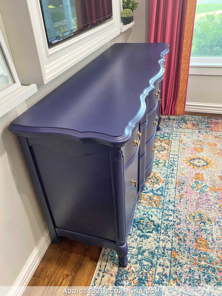
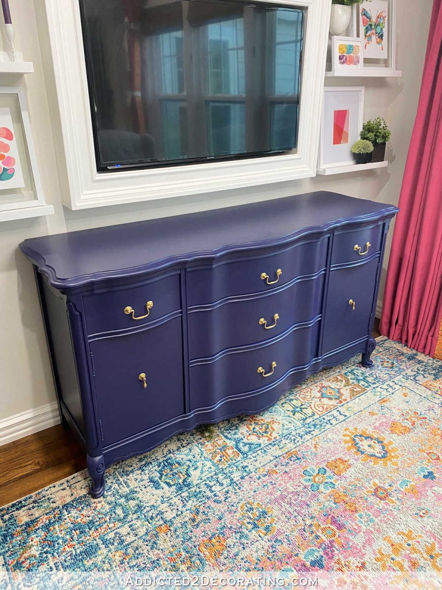
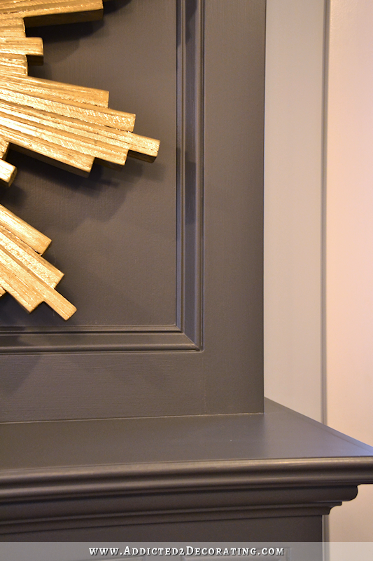
So I went back to Home Depot and looked at the Behr colors, and selected the deepest, darkest purple/eggplant that still looked purple (I didn’t want one that looked like black with purple undertones), and I ended up with a color called Black Sapphire. Aren’t sapphires blue? But this was located in the purple section, and it’s very obviously a deep purple.
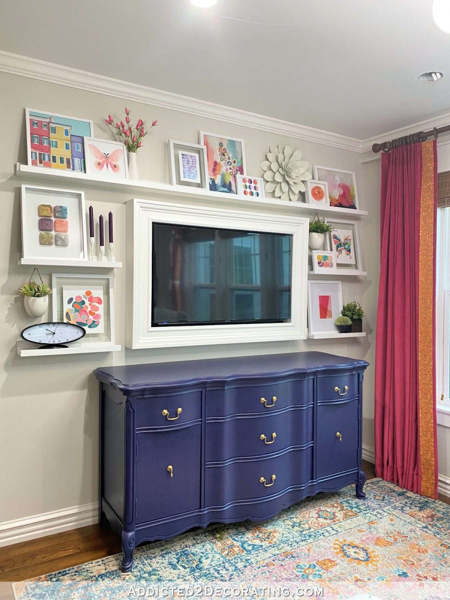
And the best thing about this color is that it stays a deep dark purple even during the brightest part of the day.

This was not a big, drawn out project. I didn’t even move it out of the room. I simply put some thick paper under the buffet, did the fastest sanding you’ve ever seen (I took about five minutes to sand the whole thing with 220-grit sandpaper), added a bit of Floetrol to a new quart of paint, and brushed it on. Two coats later, I was done. The whole thing took about an hour-and-a-half.
I’m so glad I took the time to do it, because this new color is so dark and rich, and it can definitely hold its own against the bold, saturated color on the curtains.
If you want more details on how to paint furniture, I wrote a post way back in 2013 on how to get a near-perfect paint finish with a paint brush. I haven’t changed my process in all these years. And once you get the foundational steps done (sanding, repair, priming, etc.), then changing colors like I did on this buffet is very quick and easy. All it takes is just a tiny bit of sanding, and a new color on top. That’s why I always stress getting those foundational steps right and not trying to find a way to skip over them for the sake of convenience.

Addicted 2 Decorating is where I share my DIY and decorating journey as I remodel and decorate the 1948 fixer upper that my husband, Matt, and I bought in 2013. Matt has M.S. and is unable to do physical work, so I do the majority of the work on the house by myself. You can learn more about me here.


Oh my! You have a great instinct and eye. The new purple makes no apology.😀Holding its own. I love it!
I, too, thought it looked washed out but then said to myself that it probably looked fine in person. But, boy, what an improvement!!! Love how this room has come together!
I am so glad that you left it purple. I LOVE it!! Absolutely gorgeous.
SO. MUCH. BETTER!!!!
WOW – stunning. I am saving your post as I still am struggling with getting a piece of furniture beautiful like yours. Here I go again! Please tell me how you are getting your curtains “trained” ? I have a set that is just a crazy mess. Thanks.
These are being much more stubborn than most since they’re a thick velvet. But generally it’s just a matter of starting at the top and folding the fabric along the pleats, then tying a strip of fabric around the curtain. Then fold the next 12-18 inches of the curtain along the pleated folds, and tie that in place. I do that in about 4-5 places all the way down the curtain. Then I leave it like that for a few days. To help it along, I generally use my steam iron to steam the folds in place along the front of the curtain from top to bottom. After a few days, and a steam from my iron, the folds usually stay in place quite nicely on their own. But this velvet (which is actually upholstery velvet) is being quite stubborn. They look better than they did before, but they’re certainly not as well-behaved as a fabric like decorator cotton would be. 🙂
Thank you for that – I will give it a try. Mine look absolutely awful, and I keep waiting for an improvement that is not happening from just hanging. Yours look so much better now…I’m trying your process. PS) I adore that new color purple.
Love this color. Good job
It’s beautiful!
I love the Black Sapphire dresser!
Oooh, handsome! Nice change up!
Friends and family have laughed heartily at me and my quests for the perfect shade of a color for walls or fabrics. I love hearing that there are others who aren’t willing to accept something that is just good enough. Your room looks great!
Same with me!
One word. Gorgeous.
Nice change.
Do you think swapping out lighting to a higher temp impacted how the color appeared?
That definitely had an impact. The colors look truer now, and most of them look so much brighter and clearer and less “muddy” now.
Looks brilliant. Gorgeous colour even in the full sunlight. This room feels so full of joy.
Yup plays splendidly with the drapes and rug. ENJOY!
Following your blog over time there are occasionally times when something didn’t quite sing for me as it did for you. The former purple was one of those but I chalked it up to colors don’t always come through or read properly on photos/other computers. If you’re happy, good enough for me. I have wondered about blues and purples in photos. Your corals, deep pinks, even teals always seemed congruent. I admire how at peace you are with redoing. It takes me so long to get something done the first time, I feel so vested that I struggle with changing. I urgently want to get my own home in “adult”, post parent decor…. like ALL done, enjoy for awhile. I need to take a nod from you, get crackin’!
Purple and gold, baby, purple and gold! LOVE it!
I really like the new purple color! It makes the purple accents on the shelves pop, where before I mainly saw the pinks. Excellent!!
Spot on, girl!
Sapphires are many different colors, not just blue. There are red sapphires too, besides other colors.
This turned out beautiful, and I love it next to your curtains with all the accessories above it.
I love the way the wall turned out and the buffet looks fab in that darker color.
Love that color even better than the last!
It looks amazing! I always thought that room was pretty but it’s just WOW now!
Oh yeah I forgot to mention that the styling of the art on the shelves looks great too! What a happy spot🙂
Wow! I was looking at paint colors today looking for the darkest purple I could find snd it was Black Sapphire! But now seeing it on your furniture I know my husband will not go for our bedroom. Back to the colors, I go! You saved me days of debate! 🙂
Hi Kristi, I have a question if I may?
In the link for how to get near flawless finish on cabinets, you advise to remove the doors and paint them horizontally. So did you do this with your buffet or did you decide not to?
I presume it’s best to do so, and on drawer fronts also. But is it absolutely necessary?
Love your work and your generosity to share with us. You inspire me and because of you, I’m beginning to have faith in my own abilities …. thankyou.
I didn’t do it on this one this time (although I did the other times I painted it), so it’s not absolutely necessary. It is the best way to do it, though.
Beautiful!!
I was thinking the dresser needed a stronger color after the curtains as well! Black Sapphire is perfect!!!
Was thinking an almost dresser height potted plant would look nice on either side of the dresser to better
ground the larger wall display…or a couple of colorful ethnic baskets, stools with large, colorful book stacks, or?
I actually went to Home Depot yesterday and picked up a plant. I just need something pretty to put it in. 🙂
I thought the original purple was perfect- but THIS!!!! All the heart eyes!!!!!!!
Dark Sapphire is a win! I just love purple. I’m a purple girl, too, so much so that I painted my kitchen TCU purple at one time. I’m up here in Fort Worth, Kristi so I know you know what color I’m talking about. I am so envious of your energy to get things done.
Perfect!! It’s even classier than before, as well. I do have to say I detect a hint of blue (on my screen anyway) in the new purple which undoubtedly gives it that beautiful richness. You are the painting queen for sure. I haven’t done any painting that requires it recently, but I’m going to use your tip for adding Flotroel to the paint. Back in the day when I used BM Alkyd paints I never had brush marks, but today’s water-based paints are another story.
That looks wonderful, Kristi! I really love the new color!
I thought the color was great before but have to say I love this color, beautiful!
I was wondering how the bathroom is coming and what decisions you’ve made on the mural.
You always inspire to do better. I am painting my foyer ceiling a silver metallic. I’ve gone from gold to bronze to now silver. I just think the silver needs to have some black in it to look like an antique finish and not so silver if you know what I mean. Any suggestions you can offer would be appreciated.
Luv it, luv it, luv it!!
Gorgeous!
Hi Kristi,
where can I purchase the product Flotroel that Diane mentioned to add to paint, I prefer to paint with a brush but have had problems with the brrush strokes. Thanks for the inspiration
I purchase it at Home Depot. I’m pretty sure Lowe’s would have it, too.
Excellent choice going with the darker color. Looks great. Only you would successfully paint without mishap while it was standing where you have it placed. Well done.